I promised myself I’d write about the architecture for Rooms months ago but a semester later and here I am with only 3 published posts and a handful more sitting in the repo. I figured then I’d try writing an evolving article detailing not just my architecture but the reasoning and learning behind the development of Rooms like all those cool kids working at the cool companies with their cool dev blogs.
I figure this could also form an informal basis for my big picture documentation down the line.
How It Started
My friend Michael approached me a semester and summer ago with an idea for the C3 Innovation Grant. He suggested a simple web frontend that just called the APIs of various buildings’ room reservation apps.
Riding the high of the increasing autonomy and energy of my projects with NYU STIT was interested in a more all-encompassing solution for students - something I’d want to use myself.
The Stack
- Progressive Web App powered by React
- API Gateway + AWS Lambda trivialized by Serverless Framework
- DynamoDB
- CloudWatch + Grafana for metrics
- CodePipeline for CDCI
Designing
I wanted to create an app the provided the following services:
- Reserve a room at any accessible location on campus
- Automatically exclude locations for which the student wasn’t authorized to use (like Law Library rooms) without forcing the authorized students to use two - or more - apps
- Remember past and current reservations
- Offer crowd-sourced data on the amenities available to a specific room
- Gather metrics for cool inferences for NYU!
To design the frontend I used Figma.
I wanted to break out of NYU purple and some of the more sterile designs of our existing canonical web content. As a result I ended up trying to go for a ‘sleek’ or ‘modern’ design. I’m working with our designer to see where it can be made more friendly. I’ve found that Material designs can really make flat designs more accessible.
Said poor designer is also responsible for generating wider width designs but Figma makes responsive design a breeze.
I toyed with a few variations of the loading/landing page:
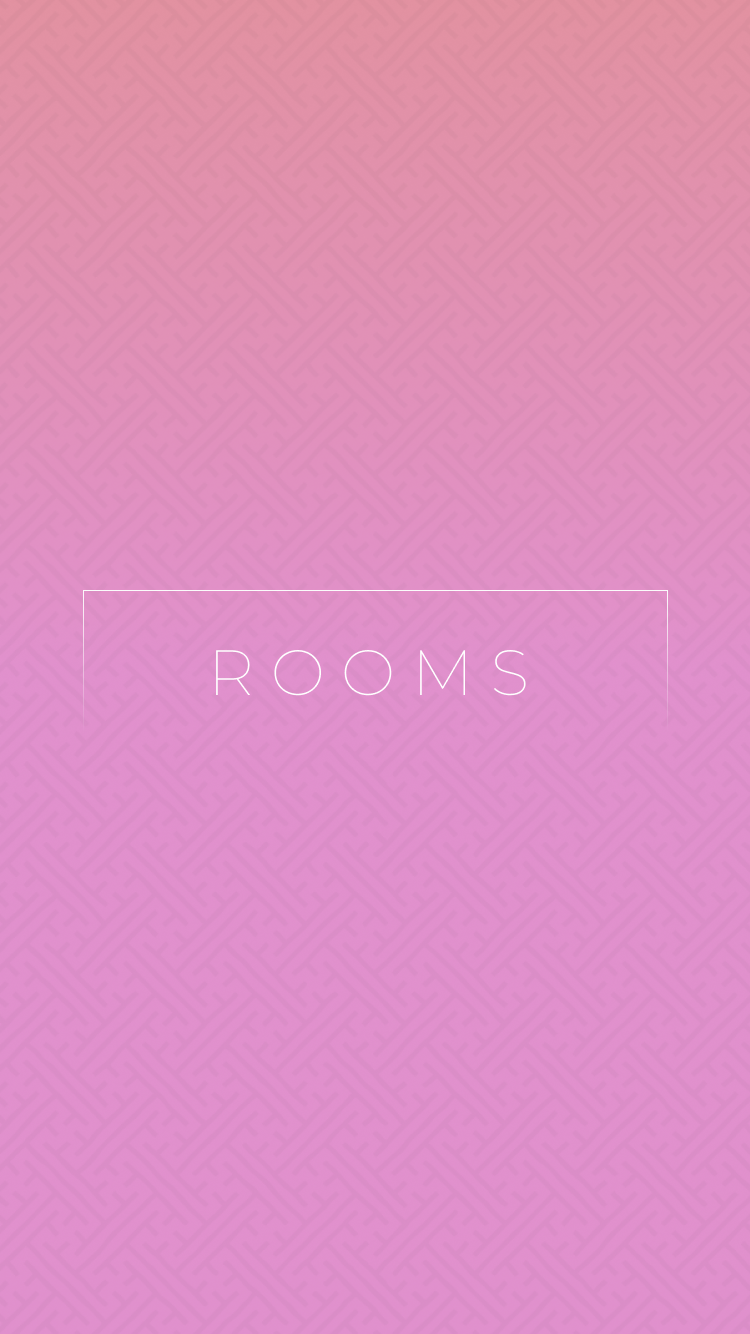
The center symbol/image is meant to rotate as the app loads. Hopefully they shouldn’t rotate for long.

I wanted to evoke Bobst so I took an old photo from the design spec of Bobst’s floor plan from the original designer’s webpage… I think - I don’t remember anymore. I might have to take an actual photo of the floor if we end up doing this design.

And a somewhat pretentious icon:
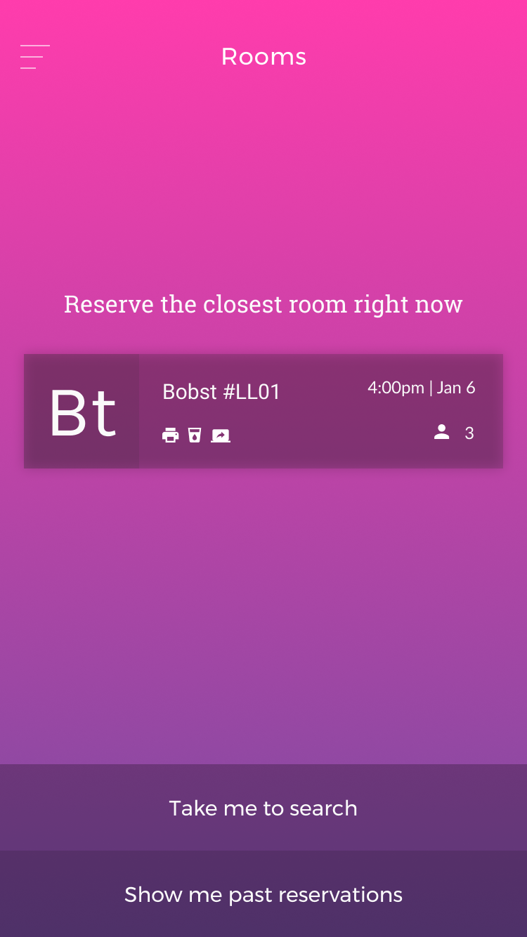
The home page demonstrates the two most important features from above plus another (with its own endpoint): an immediate ‘gimme a room now’ feature that uses the location of the agent. Conveniently, Alexa supports location thru its Device Address API!
I’ve also designed a search page first draft. Currently it’s cluttered and could afford smaller type, icons and more whitespace.
It supports a list view but I need (to delegate to our designer) to design a time table and map view. The latter is a feature requested by everyone I talk to about and seems an intuitive choice but I suspect given the mutual proximity of the buildings at NYU’s Washington Square and Brooklyn campuses (campi?) that it may end up useless. The proof will be in the metrics!
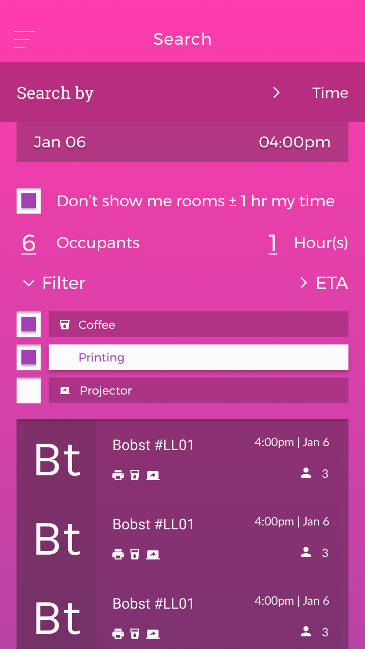
You may notice >2 fonts in use. I apologize. They will be squashed as the designs are finalized.
In designing this I tried to create a vocabulary to uniquely identify the app - this has manifested mostly in the Periodic Table iconography for the buildings. After many iterations I decided I quite like the idea of a two letter identifier for each building based on what I call a Shortcode - I’ve defined a way to name each building at NYU with a five letter ID. The rules for this derivation are detailed such that future devs or maintainers could easily create their own. From this Shortcode the first and last letters are used to create the ‘Periodic’ id. Other aesthetic considerations were trying to marry flat design and Material design but since one is inspired by the other I guess it’s just inspired by the latter.
You may also notice the list of amenities in the ‘Filter’ dropdown - how these work logically will be detailed in the backend section and how they’re collected will be described in the frontend section.
##
#